Why a Low Ceiling Changes the Shape of a Scene
Why a low ceiling changes the shape of a scene: see how a small theater can preserve visual scale by simplifying vertical elements and sightlines.
Why does a low ceiling make a scene feel smaller even when the stage is wide? In a small theater, ceiling height changes the audience’s sense of scale before the actors speak: a tall doorway, hanging banner, or raised platform can seem to press the room downward. The useful response is often subtraction, not more scenery.
Imagine a hypothetical neighborhood theater with a broad playing area, a low ceiling, and a scene set in a grand civic hall. The production team begins with a familiar picture: tall columns, a high central arch, and a staircase rising behind the actors. As those elements are sketched into the actual room, the ceiling becomes part of the composition. The staircase points up toward a surface that is already close, while the arch seems to cap the action. The room reads as crowded, not grand.
Why a low ceiling changes the shape of a scene
Audiences do not judge scale by scenery alone. They read the space between the actors, the set, and the room around them. A vertical line normally suggests height, distance, or authority. Under a low ceiling, a tall flat or a hanging object can instead emphasize the ceiling’s limit. The eye follows the line upward and finds nowhere for it to go.
That effect can also alter the acting space. If a bulky portal or decorative frame occupies the upper part of the stage, performers may appear boxed in, even when they have room to move laterally. The audience sees the architecture and the performers at once; both compete for the same visual territory.
For the imagined civic hall, the team treats the room itself as a fixed part of the scene rather than a flaw to conceal. They keep the idea of public grandeur but stop trying to show it through height. That decision gives the production a clearer visual problem to solve: how can a hall feel important without reaching upward?
The first design makes the room feel tighter
In the hypothetical walk-through, the first model uses lightweight flats to suggest columns, a painted arch, and a staircase unit. On paper, these pieces signal a grand interior. In the venue, the upper edges sit close to the ceiling, and the staircase divides attention between its climb and the low overhead plane. The design has added information, but not the feeling it was meant to create.
The team then asks which parts carry the scene’s meaning. The audience needs to understand that this is a formal public space, that characters can enter from different directions, and that the hall gives one character a place to address the others. None of those ideas requires a tall arch. The decorative height is a visual cue, not the scene’s essential action.
So the designers remove the staircase and reduce the columns to a few narrow, grounded elements. They leave more open space above the actors. The architecture now frames the playing area instead of filling it, and the ceiling stops competing with a set that no longer points insistently upward.
Simplify vertical elements and let the scene spread sideways
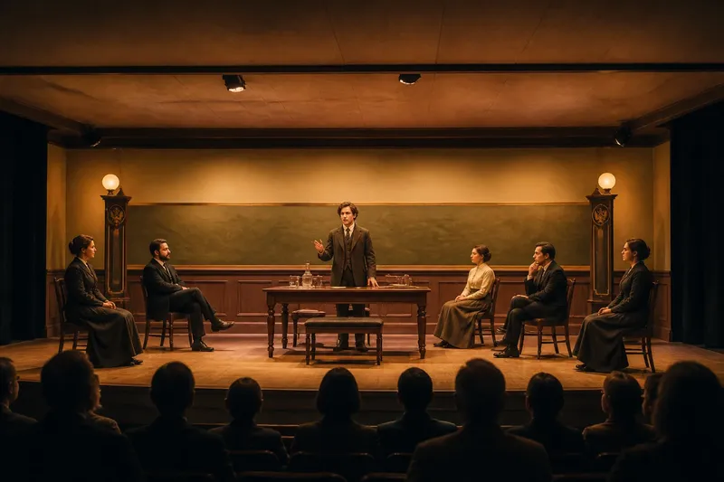
The revised design keeps a strong outline at audience level. A low bench, a central table, and two slim side markers establish the hall’s form without building a wall of scenery. A broad band of color across the back suggests a formal interior. The composition remains legible from the seats, but its emphasis shifts from height to width, spacing, and movement.
That shift can shape blocking, too. In the invented situation, the speaker no longer climbs above the group. Instead, other characters create a clear semicircle, leaving an open lane through the middle. A pause at the table and a turn toward the room’s widest sightline give the speech weight. The expected visible result is a gathering that feels public and deliberate, rather than a group squeezed beneath a lofty imitation.
Lighting can support the same choice without adding another structure. A gentle change in color across the back wall can separate the playing area from the surrounding room. The production need not fill the ceiling with scenery or draw attention to it with a strong upward beam. The audience can read the change in atmosphere while keeping its attention on faces and action.
Check the view from different seats
A design that looks balanced from the center aisle may feel very different at the sides. For the hypothetical production, the team checks sightlines from several actual seats, including the edges of the audience area. They look for whether the reduced side elements still identify the setting, whether performers remain clear against the back, and whether any vertical piece cuts across a face or gesture.
Those observations guide small, practical edits. If a marker hides an actor from one side, it can move farther outward or become narrower. If the table blocks the group’s movement, its position can change. If the back color is too busy behind the speaker, the designers can simplify it. Each adjustment serves readability rather than trying to disguise the dimensions of the room.
Say the team notices that the side marker nearest the audience obscures a seated character during the central speech. They shift it toward the edge and turn the chair slightly inward. The expected result is a clearer view of the character’s reaction, while the setting still reads as formal. No extra scenery is needed to repair the composition.
What should a low-ceiling design preserve?
Can a small theater still suggest grandeur?
Yes. Grandeur can come from ceremony, deliberate spacing, and a strong focal point rather than towering scenery. A composed group around a central table may suggest authority more clearly than an oversized arch.
Should every tall set piece be removed?
No. A vertical element can remain if it contributes a clear story or visual function and does not overwhelm the room. Keep it selective, and judge its effect from the seats rather than from a drawing alone.
How can the production use the ceiling itself?
It can leave the overhead area visually quiet so attention stays on the actors and the scene’s horizontal arrangement. If lighting or hanging elements are being considered, follow venue rules and consult the appropriate qualified crew; do not improvise overhead rigging.
What if the setting depends on a tall landmark?
Suggest the landmark through a partial outline, a spoken reference, or a compact visual motif instead of reproducing its full height. The audience can complete the image when the essential clue is clear.
Let the room set the scale
The imagined civic hall begins with a design that tries to make a small venue look tall. It ends with a more open arrangement that gives the actors room to command attention. The revised scene preserves its public formality through spacing, a central gathering point, and restrained architectural cues, while avoiding a stack of vertical objects beneath a low ceiling.
For anyone shaping a scene in a low-ceiling theater, the useful question is not how to hide the room. Ask which visual cues the audience truly needs, then give those cues enough space to read. When the ceiling limits upward movement, a scene can gain presence by becoming clearer across the stage.